A few degrees of warming is incredibly significant.
The Intergovernmental Panel on Climate Change (IPCC) strongly recommends limiting the global temperature increase to 1.5°C, to avoid the impacts of climate change steeply escalating. Even at 1.5°C of global warming, times will be tough. But the impacts amplify rapidly between just 1.5°C and 2°C of temperature increase, as visible in the following infographic.
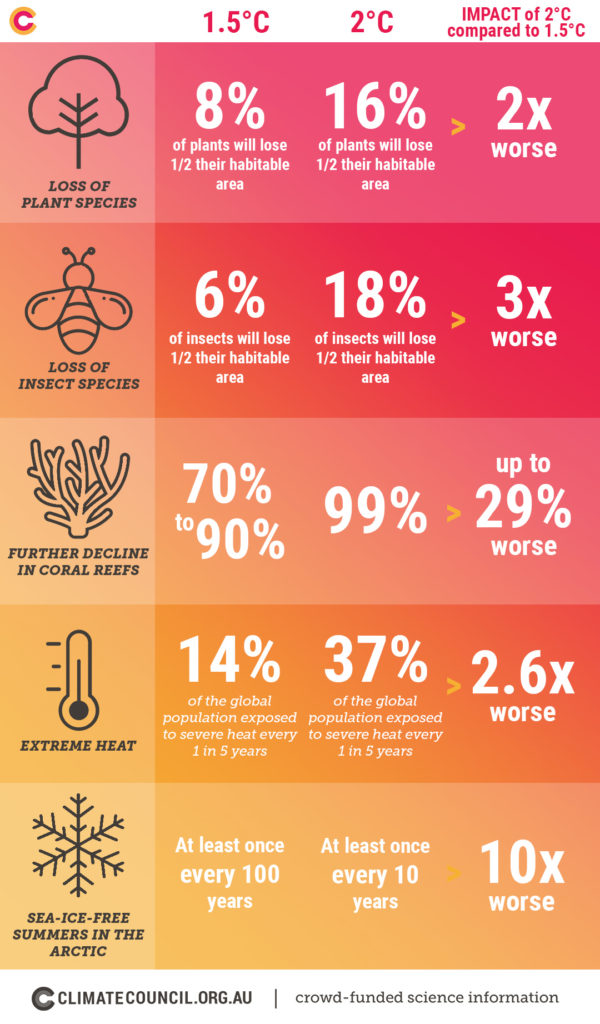
Adapted from WRI (07/10/18) based on data from IPCC (10/2018).
To avoid the impacts we’d experience at 2 degrees warming, we have no other choice but to limit our warming to 1.5 ̊C. It is still possible, but only if we act now.
If nothing changes, we are on track for a rise in temperatures of between 4-6 ̊C. To put this in context, the difference in temperatures between now and the last ice age was around 4 ̊C.
Read more:
The good, the bad and the ugly: Limiting temperature rise to 1.5 degrees
What is climate change and what can we do about it?