A visual heat map comparison

140-year heat map shows clear trend in global temperature change

This content is 6 years old.

Sometimes it’s hard to get a clear grasp on just how much the climate has changed and where we sit now, compared to the climate of the past.

With the United States’ National Oceanic and Atmospheric Administration’s (NOAA) announcement that 2019 was the second hottest year on record, we’ve decided to try to put the last 140 years into context.

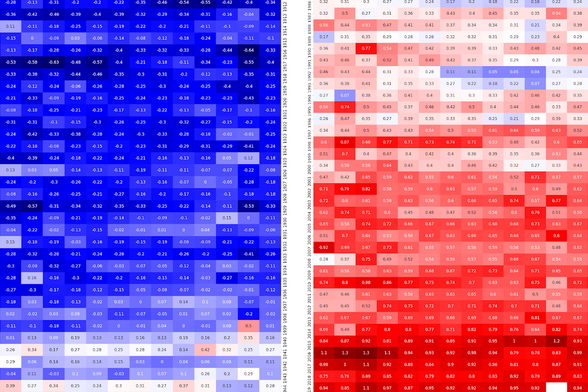
The heat map below compares every month to the average temperature of that same month throughout the 20th Century, since 1880. So, for example, the temperature of each individual June is compared to the average of all 100 Junes between 1901 and 2000, each July is compared to 100-years of Julys, and so on.

For Australia, data from the Bureau of Meteorology shows that 2019 was not just the hottest year, but also the driest year on record.

Fast Facts

– 2019 was the second hottest year on record for the planet.

– The last six years are the six hottest years on record (in order: 2016, 2019, 2015, 2017, 2018 and 2014).

– There have been nineteen years in the 21st Century, and all of them are in the top twenty hottest years on record. The other year in the top twenty is 1998, which sits at tenth.

A visual map showing the average temperatures of months of the year, ranging from blue (normal) to red (far above average).

Data source: NOAA National Centers for Environmental Information, Climate at a Glance: Global Time Series, published January 2020, retrieved on January 18, 2020 from https://www.ncdc.noaa.gov/cag/

 

How much space do renewables really need?

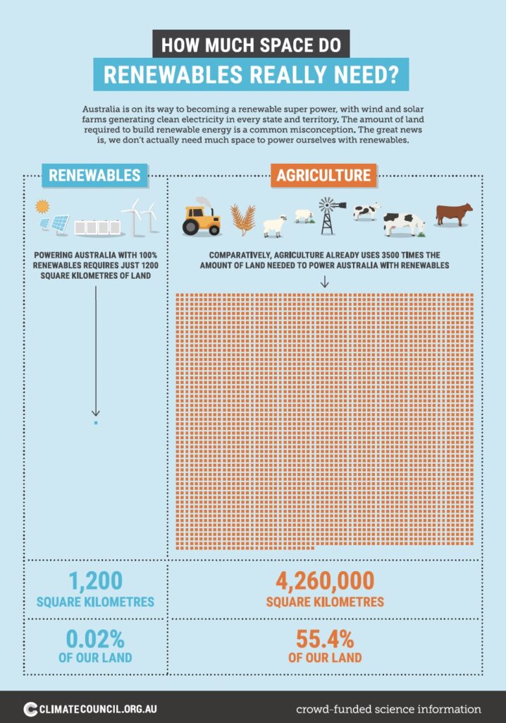
Australia is on its way to becoming a renewable super power, with wind and solar farms generating clean electricity in every state and territory. The amount of land required to build renewable energy is a common misconception. The great news is, we don’t actually need that much space to power ourselves with renewables.

2024 progress scorecard: How states and territories measure up

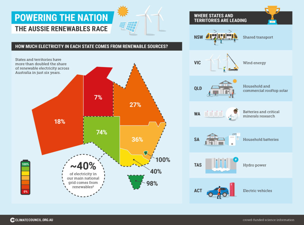
Nowhere is our rapid shift towards an economy powered by renewable energy more visible than at the state and territory level, where governments, communities and households are leading the charge. This transformation is dynamic, with different states and territories leading the way on different aspects.

What is coral bleaching infographic

Coral reefs are highly vulnerable to climate pollution. Warmer ocean temperatures and other stressors cause coral bleaching events which can damage and destroy coral reefs and the ecosystems the support. Mass coral bleaching is a recent phenomenon. The first global bleaching event occurred in 1998.

How Polluting is Australia vs UAE

Australia continues to fuel the climate crisis through its enormous fossil fuel exports. Australia is the world’s fifth largest overall producer of coal and seventh biggest producer of gas (UNEP 2023a). Most of this is not needed for our own energy needs, and is sold offshore. That’s why Australia is the world’s third largest fossil fuel exporter.

The Climate Crisis is an oceans crisis

The ocean is at the heart of the earth’s climate system. this means climate change – driven by the burning of coal, oil and gas – is rapidly transforming our oceans as well as our climate.

Electric Ute parked in front of wind turbines

Electric utes available now and in the future

Utes have long been part of work life in Australia, used in particular for construction, mining and agriculture. Some drivers also use them for convenience and recreation, with utes now making up one in five new car sales. The good news is zero emissions electric utes are on the way.